
Artifacts – How might we create a tool that helps users navigate an art gallery?
The product
Artifacts is an audio tour app that I designed as part of Google’s UX Design Certificate program. The app is intended to guide users to featured pieces of art and immerse them in an experience of learning and exploration while navigating through an art gallery.
Project Overview
The Problem
Navigating an art gallery the traditional way can be overwhelming and offers few assistive technologies.
The Goal
Design an app that makes assistive technologies available to users and guides them through an art gallery. Providing an equitable experience that is explorative and gives users a way to learn about art.
My Role
Sole UX designer for the ARTifacts app from conception to delivery.
Responsibilities
Conducting interviews and competitive audits, paper and digital wireframing, low and high-fidelity prototyping, conducting usability studies, designing for accessibility, and iterating on designs.
Understanding the user
User research summary
I referenced interview questions to create personas to understand the users’ perspectives and define pain points and goals. This helped to better my understanding of who I was designing for.
Review of the user groups defined a gallery’s customers and substantiated my assumption that many users would have difficulties navigating an art gallery, but also that each user would have individual needs for their experiences. Other interests included a desire to explore and have more opportunities to educate.
Personas

Problem Statement: Miriam is a retiree that uses the assistance of a walker to get around who needs to direct their way through a crowded art studio and explore each piece of art because they enjoy experiencing new things, but have difficulties navigating with limited mobility.
User journey map
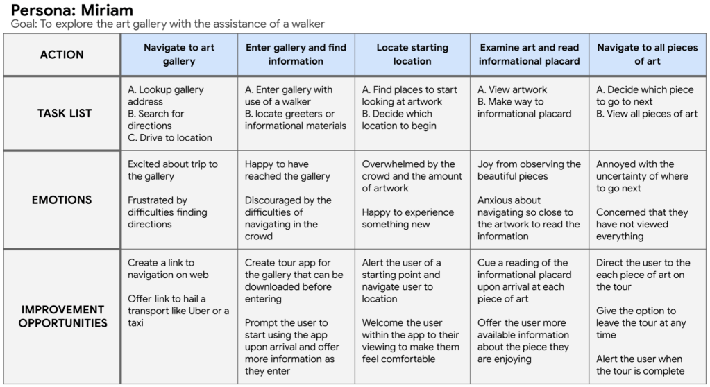
Pain points
- There can be difficulties navigating an art gallery. Some users would like more guidance.
- Assistive technologies are not regularly available and this can make it difficult and deter users from the experience.
- Users have difficulties with the length of time they require for their experience. Each user would like to explore at their own speed.
- Opportunities to learn more or educate are not readily available to the users.
Starting the design
Paper wireframes

While sketching, I concentrated on finding several different designs. My goal was to find a design that provided what the user needs, but to keep it simple and easy to navigate.
Digital wireframes
My goal was to make the app easy to navigate and build in assistive technologies that would make the experience of the art gallery accessible to more users.

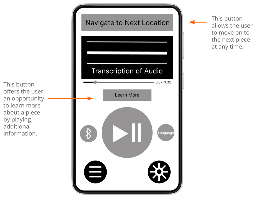
Additionally, giving the users control of their experience and the time it takes to complete the tour while offering opportunities to explore and learn more when interested.
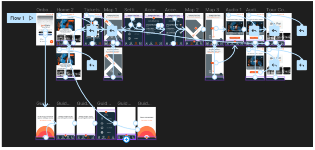
Low-fidelity prototype
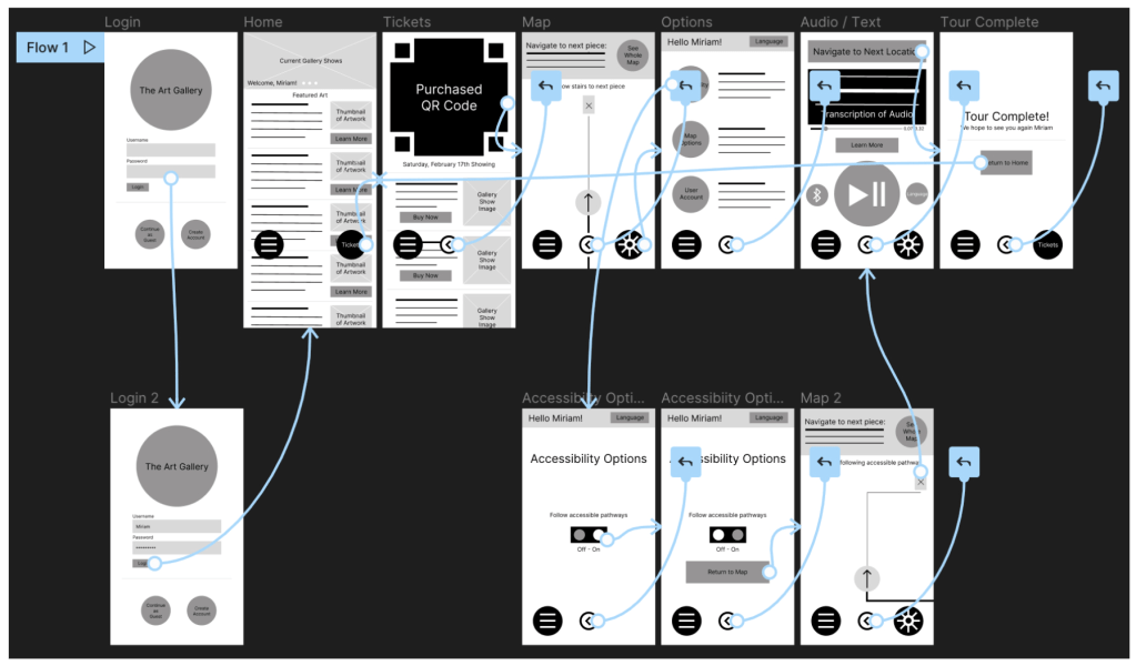
The low-fidelity prototype connected the primary user flow of using the app to complete the gallery tour, so the prototype could be used in a usability study.
Usability study findings
Round 1
- Users have difficulties recognizing and navigating the Tickets feature.
- Users want clear labeling throughout the app.
- Users need clear guidance when navigating to each piece of artwork.
Round 2
- The sign in process is too complex.
- The menu bar should be more prominent.
Refining the design
Mockups
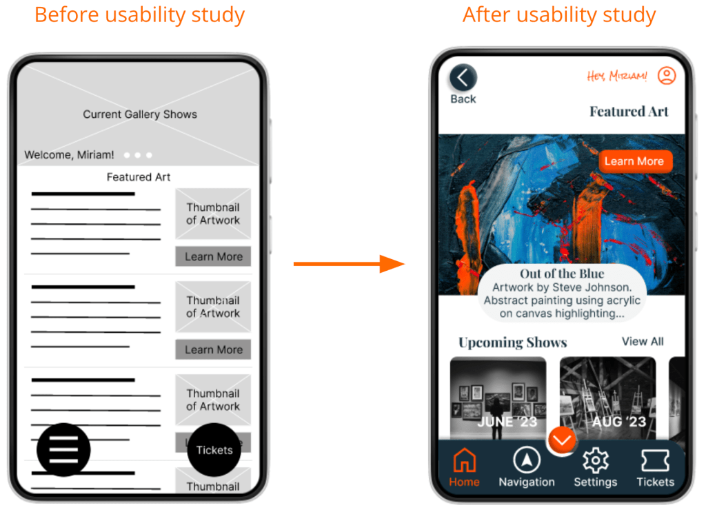
Early designs included a floating menu with icons, but after usability studies, I replaced it with a menu bar. I also added icons with text for better recognition and navigation for the users.
The second usability study uncovered difficulties with the sign in process. To simplify the flow, I redesigned the sign in page to highlight authentication logins that are less difficult for the users.


High-fidelity prototype
The final prototype presents an easier flow including a simplified sign in process and an animated tutorial guiding users through the use of the menu bar.
Accessibility considerations
- Accessibility settings were added to the sign in page and within the menu. I designed the app to consider users that have trouble with mobility. Specifically, I included a setting that only displays routes with accessible pathways when using the navigational map.
- Color and contrast were adjusted to meet accessibility standards in the attempt to make the design inclusive for users with visual disabilities such as color blindness, low vision, and other visual impairments.
- I added the option of closed captions when using the audio recordings feature and adjusted the duration and style of all animations within the design. These additions are intended to make the app inclusive for users with auditory, learning, or developmental disabilities.
Going forward
Takeaways
Impact: The app gives users a new way to experience art and includes a larger group of users that have traditionally been unable to participate.
Keeping user needs in mind at every step of the process moves us one step closer to a more accessible world of design.
What I learned: While designing the ARTifacts audio tour app, I learned to change with the needs of the users. Throughout each stage of the design, new user needs were identified. Those needs guided me in each iteration of the design. Ultimately, producing something very different from my original idea, but creating a user focused product.
A sincere thank you for reviewing my work on the ARTifiacts app! I have more to share and would enjoy the opportunity to show you what I can do.
