Mas Tacos – How might we streamline the order process for a food truck & allow users to inspect the menu?
The Product
Mas Tacos is a responsive e-commerce website that I designed as part of Google’s UX Design Certificate program. The site is intended to be used for advanced ordering & investigating the menu offerings.
Project overview
The Problem
Ordering from a food truck can be difficult and time consuming. The menus are often minimal or non descriptive and don’t offer customers ingredient lists or provide clear ways to check for common food allergens.
The Goal
Design a responsive website that allows users to place advanced orders. Providing a complete menu, including ingredient lists, that offers users an easy way to avoid common food allergens.
My Role
Sole UX designer for the Mas Tacos website from conception to delivery.
Responsibilities
Conducting interviews and competitive audits, paper and digital wireframing, low and high-fidelity prototyping, conducting usability studies, determining information architecture, responsive design, and iterating on designs.
Understanding the user
User research summary
I interviewed potential users of the Mas Tacos website to understand their perspectives and define pain points and goals. This helped to better my understanding of who I was designing for and guided me when creating personas.
Review of the recordings and notes from the interviews identified what types of users would be utilizing the Mas Tacos website. My assumptions that users would want a way to expedite the ordering process were confirmed, but I also uncovered a need for a more descriptive menu and several of the potential users vocalized a need to find allergen friendly foods.
Personas
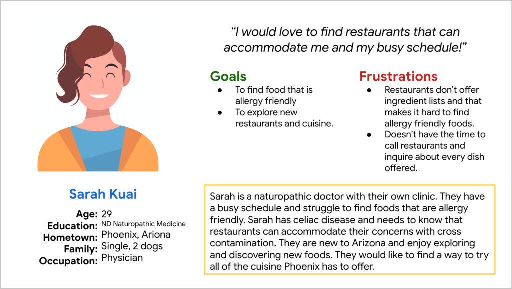
Problem Statement: Sarah is a busy physician and business owner who needs to find new allergy friendly foods while on the go because they have limited time in their schedule to cook for themself.
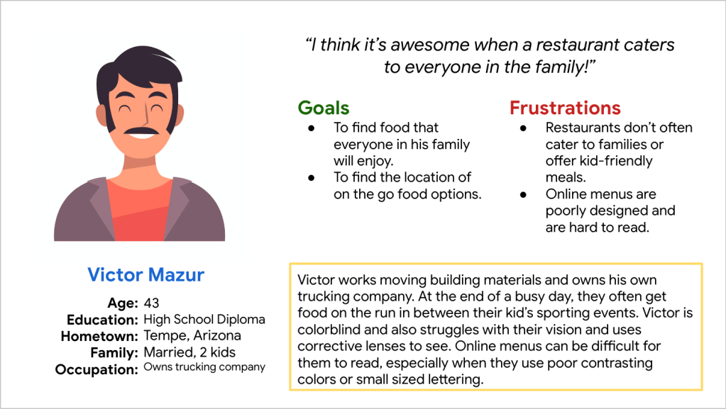
Problem Statement: Victor is a small business owner & father of two who needs to find family friendly foods on the way to their kids’ sporting events because they need get everyone fed quickly without disrupting their very busy day.
User pain points
- Ordering from a food truck is time consuming. Users need an easy way to place orders and reduce the amount of time spent.
- Food truck menus are unclear or incomplete. Users need an easy way to access menu offerings that include clear ingredient lists.
- It is often difficult to find allergy friendly foods. Users would like an easy way to find offerings that meet their needs.
Starting the design
Paper wireframes
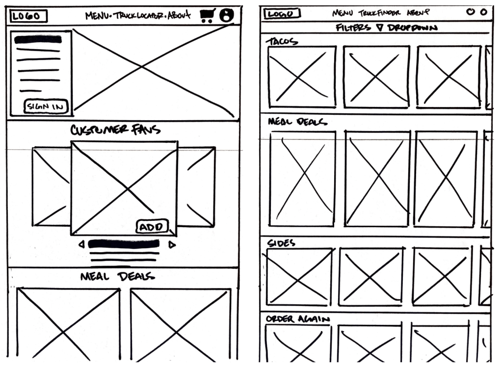
While sketching, I considered several different layouts. My goal was a simple design that would be familiar to users and easy to navigate.
Digital wireframes
Once again, I wanted my design the of homepage to be familiar to users for ease of navigation. I chose a layer cake page format with a sticky top menu bar & a hero image front and center.
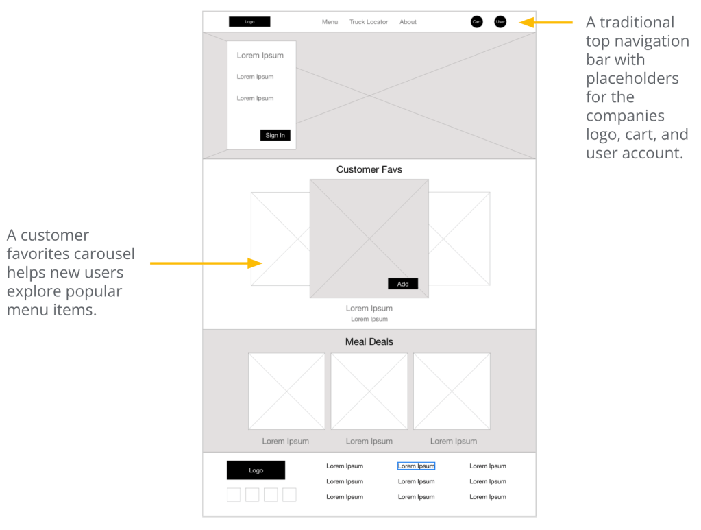

My goal was to design a menu that provides users with all of the taco truck offerings and give them a way to filter items by common food allergens.
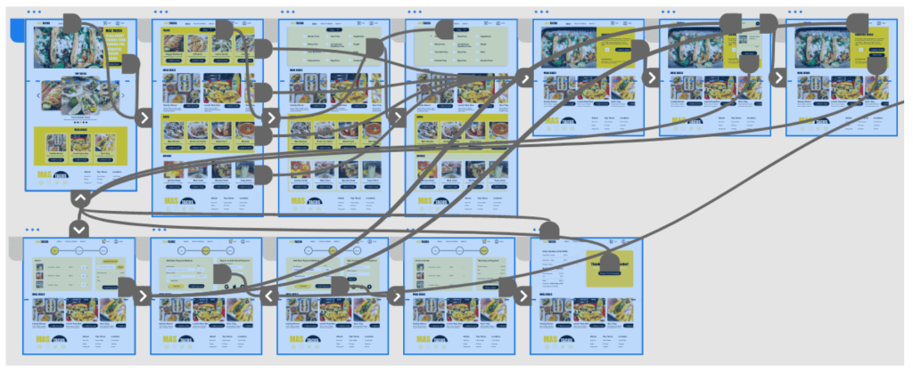
Low-fidelity prototype
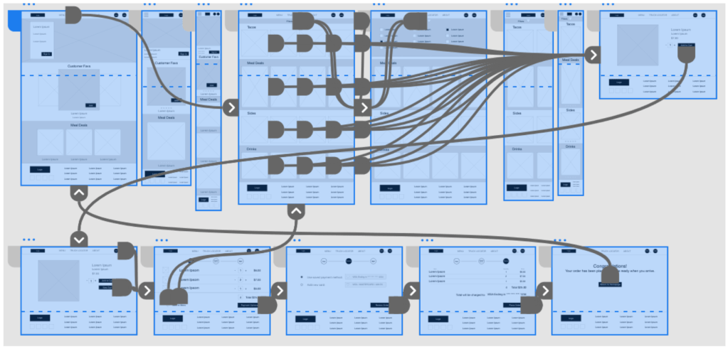
The low-fidelity prototype connected the primary user flow of using the website to place an order, so the prototype could be used in a usability study.
Usability Study findings
Round 1
- Users feel more at ease with a clear review order page.
- Users need guidance through the main user flow.
- Most users utilize the filter option.
Round 2
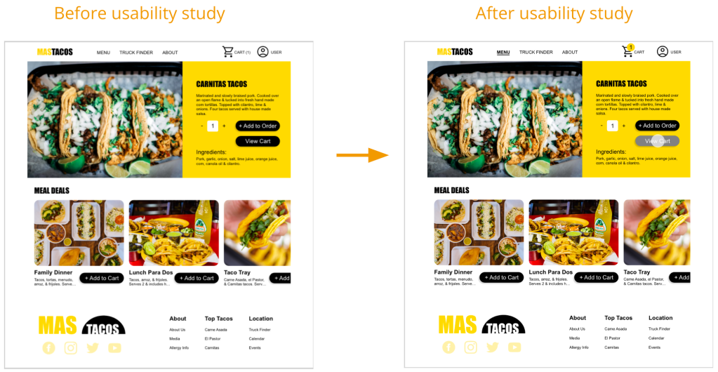
- Users need more visual cues for all interactions.
- Users need a more familiar checkout process.
- Most users utilize call to action buttons when navigating.
Refining the design
Mockups
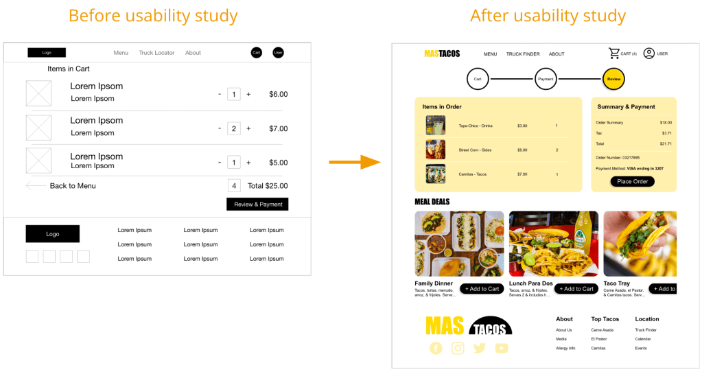
First round usability studies revealed users were weary of the unclear checkout and review process. Refined designs included a checkout progress bar and a clear review page.
Second round usability studies uncovered the need of visual cues for user interactions. I added alternate states to clicked buttons, location indicators to the navigation bar, and updated the cart icon.
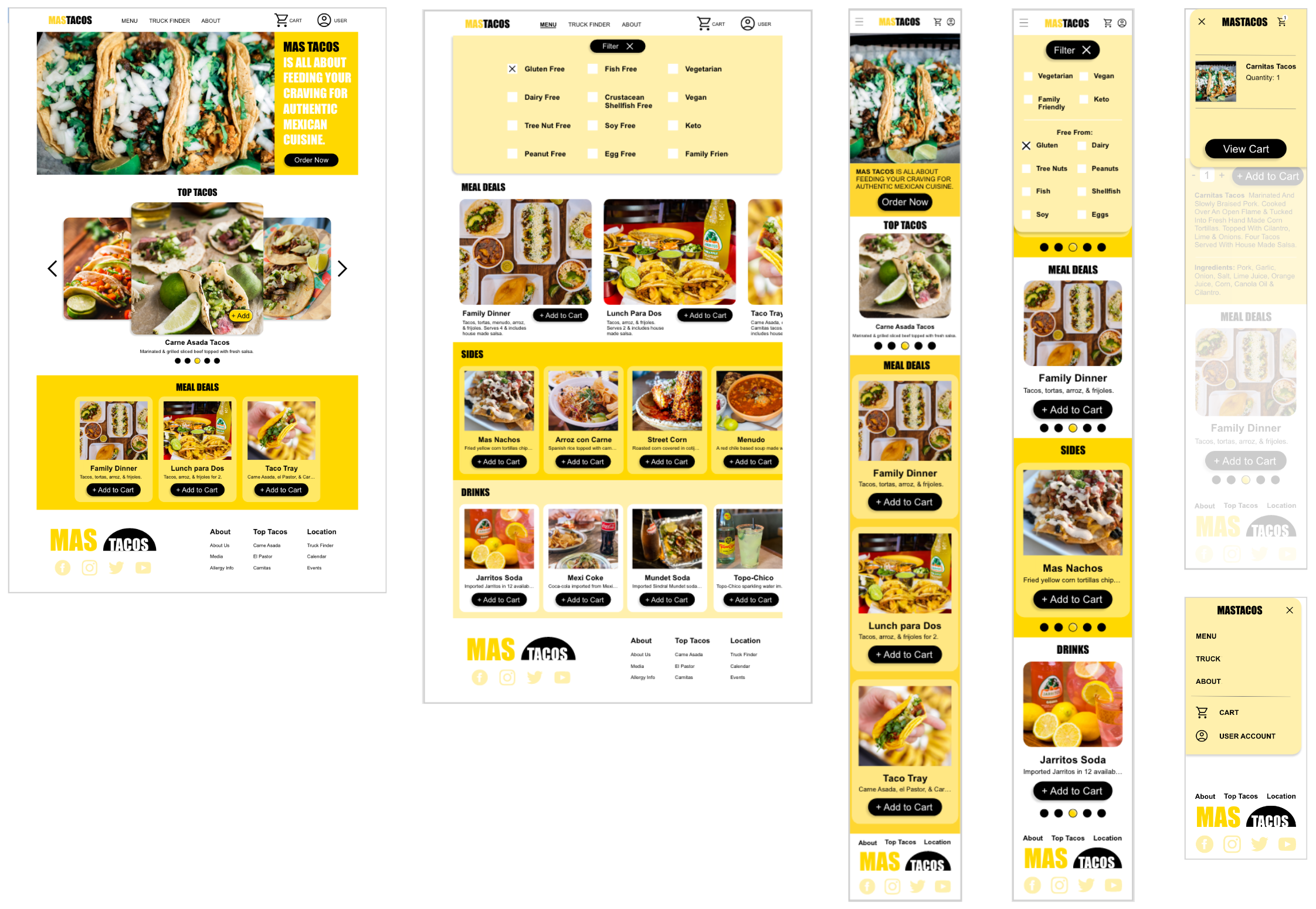
High-fidelity prototype
Accessibility considerations
- Color and contrast were adjusted to meet accessibility standards in the attempt to make the design inclusive for users with visual disabilities such as color blindness, low vision, and other visual impairments.
- Hierarchical headings and other visual hierarchy was considered throughout the design with the intention of being compatible with screen readers.
- The website is designed to be responsive and adapt to many devices making it more accessible than traditional desktop format websites in an attempt to make it available to a larger group of users.
Going Forward
Takeaways
Impact: The website gives users a new way to order and explore food offerings from a taco truck. Expediting the process and making it easier for the user and taco truck employees. In addition, it offers the owners a larger platform for presenting and selling their products.
What I learned: Collaborating with classmates through peer reviews proved to be extremely beneficial. I learned that working with a large group of people with different experiences and skills can improve the process and product. Designing with diverse users in mind while working with a group of diverse people is an amazing way to create and be creative.
A sincere thank you for reviewing my work on the Mas Tacos website! I have more to share and would enjoy the opportunity to show you what I can do.
